UX ENGINEERING
Bentolicious - Online Ordering Experience
I led the design and front-end development of Bentolicious’s direct ordering experience, while supporting a broader website redesign to align the brand and drive a 60% increase in direct orders.
TIMELINE
Jun - Sept 2025
ROLE
UX Engineer
SKILLS
Figma
Cross-Functional Collab
TEAM
2 Designers
2 UX Engineers
1 Product lead
THE PROBLEM
Our problem space
Bentolicious is a family owned Taiwanese restaurant that relied heavily on third-party delivery platforms due to the absence of a direct online ordering experience. This limited brand control, increased fees, and made it difficult to serve their growing corporate catering audience.
☁️ How might we simplify the meal detail page for users while maximizing the amount of information they are able to see while reducing cognitive load?
COMPETITOR RESEARCH
I wanted to understand the current gaps in other restaurant websites
Most local restaurants lacked mobile-friendly ordering, while fast-casual competitors prioritized speed over cultural authenticity. This gap created an opportunity for Bentolicious to stand out through a branded, frictionless ordering experience tailored to corporate catering and putting culture first.

COMPETITOR RESEARCH
"I couldn't even find the menu"
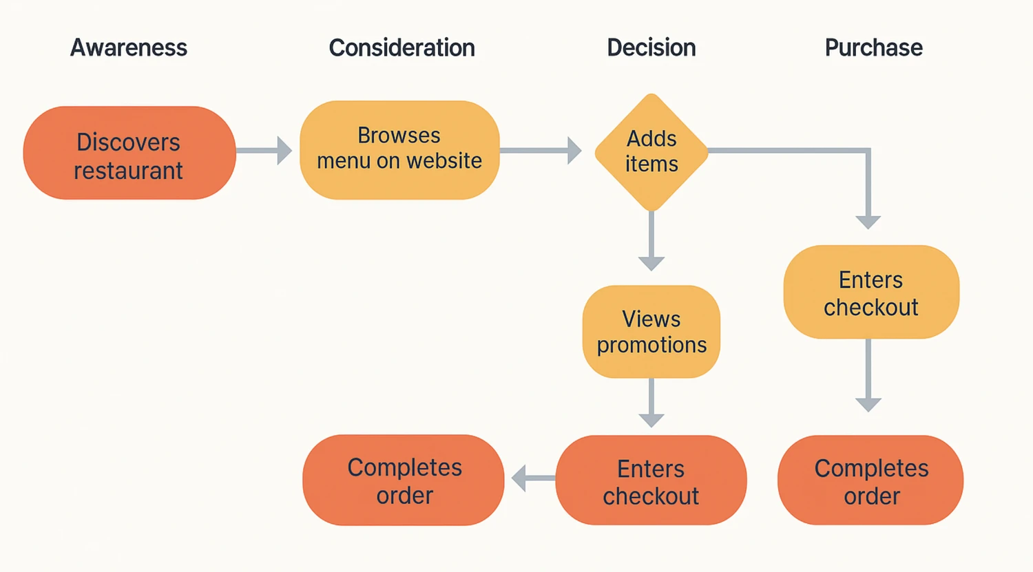
We mapped the ordering journey to uncover where friction prevented users from reaching checkout.
SURVEY
Speed and clarity matter more than brand storytelling
To understand how customers prefer to place orders, I surveyed 82 users aged 18–35 who regularly order takeout at different restaurants or on doordash.
The results showed a strong preference for ordering directly through a restaurant’s website - but only when menus, pricing, and ordering actions were immediately visible. Users were frustrated by hidden menus and unclear pricing, and consistently prioritized speed and clarity over brand storytelling. These findings directly informed our decision to design a menu-first, conversion-focused ordering experience.

SYNTHESIS
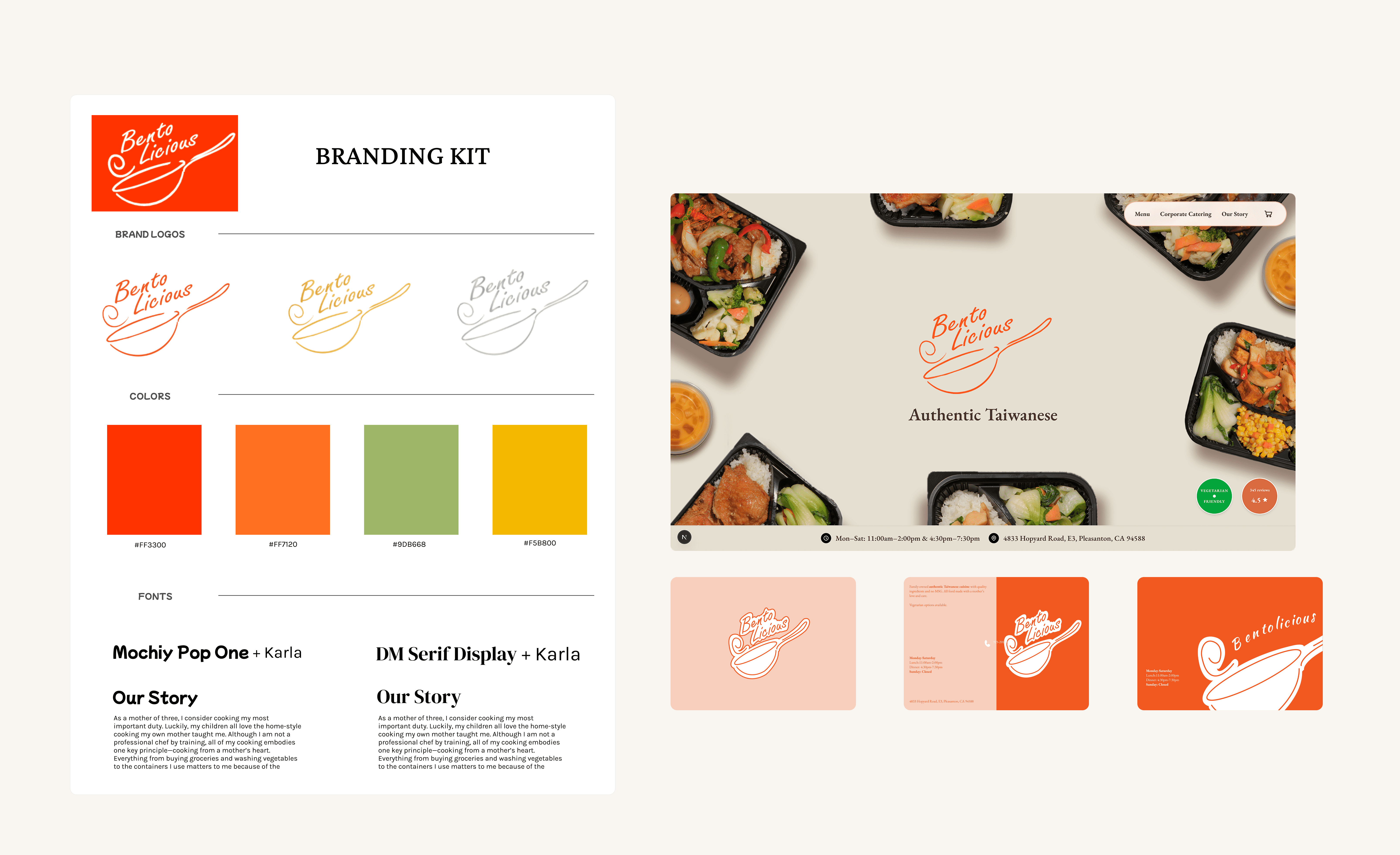
Translating brand into the ordering experience
We defined a warm, authentic brand direction rooted in trust and home-style Taiwanese cooking. I applied these principles directly to the ordering interface through color, typography, and layout to create a cohesive, brand-aligned checkout experience.
OPPORTUNITIES
Research-driven goals during the ordering experience
Based on the overarching themes and market research, I mapped the order experience to several major points focused on clarity:
⚡️
Immediate menu and CTA access
Users should be able to view the menu and start an order within one to two clicks.
🔄
Streamlined ordering flow
Reduce friction by minimizing page transitions and grouping steps logically.
🎨
Branded experience
Use warm visuals, clear brand presence, and friendly microcopy to reinforce trust and authenticity.
✅
Clear Feedback
Ensure intuitive cart behavior with visible confirmation states and clear pickup instructions.
IDEATION
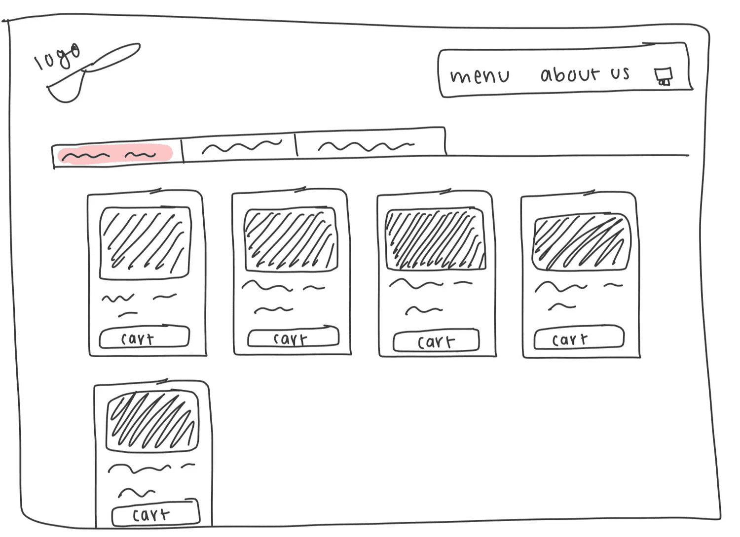
To the drawing board
To address confusion around menus and checkout, I sketched an ordering system centered on progressive disclosure and real-time feedback. Modals and a slide-out cart helped users stay oriented while customizing orders and reviewing totals.

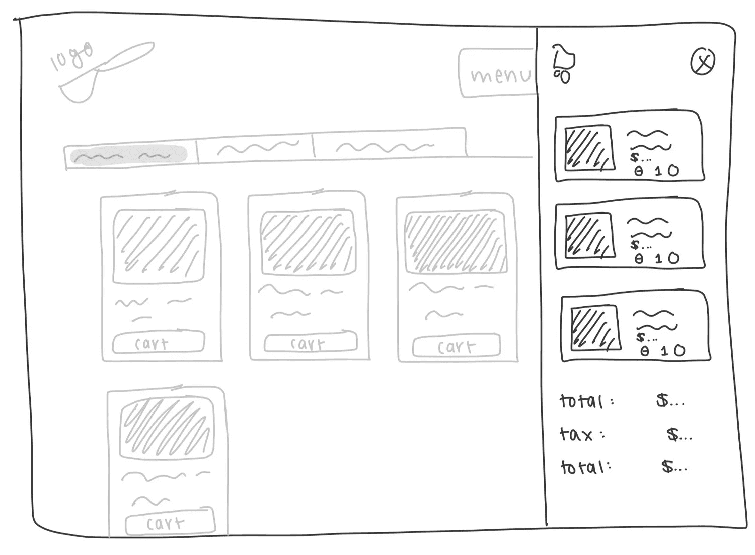
FINAL DESIGNS
I designed 3 key screens to ensure the online ordering process is as seamless for users as possible, keeping corporate catering clientele in mind
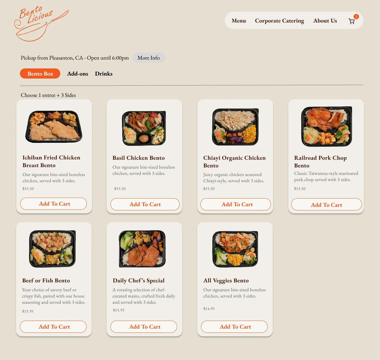
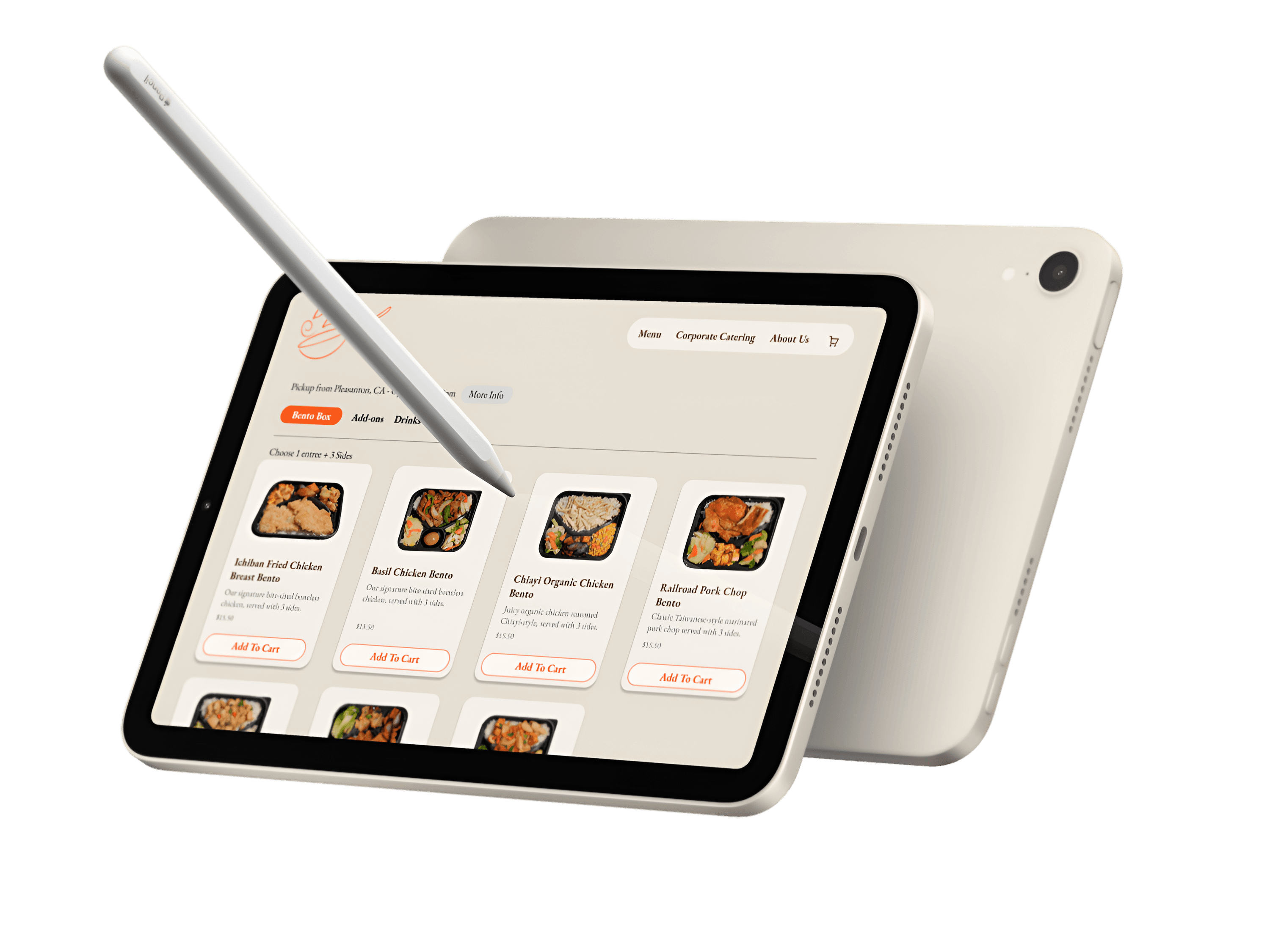
Screen 1: Online Menu Browsing
The menu prioritizes fast visual comparison by making prices, descriptions, and primary actions visible upfront. This reduces exploration friction and allows users to act immediately once they’ve decided, rather than navigating away from the menu. Lightweight cart feedback reinforces progress without interrupting the ordering flow.
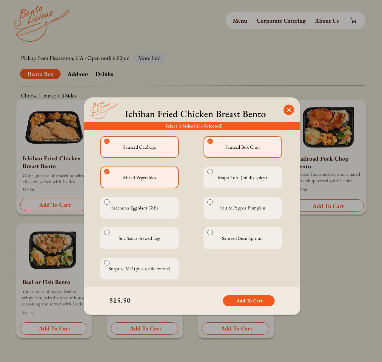
Screen 2: Side selection pop up
This modal keeps users in flow by handling required side selections without pulling them away from the menu. Clear selection limits and visual feedback reduce uncertainty while still supporting customization.
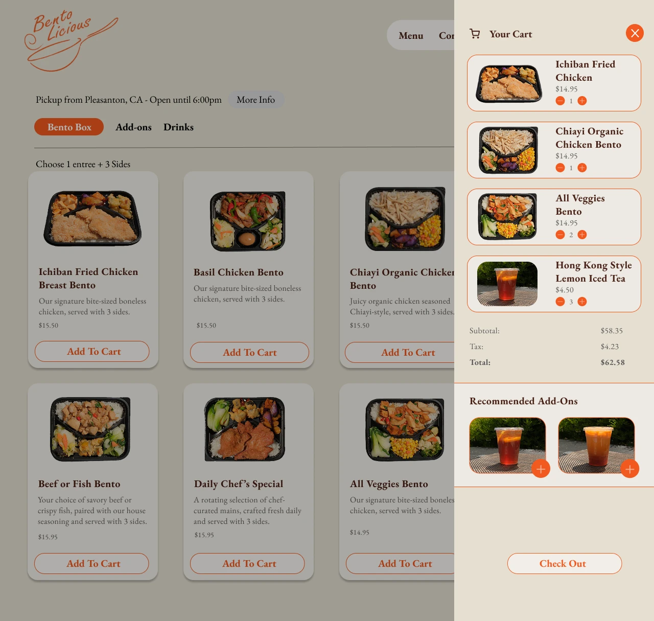
Screen 3: Slide out cart
This cart preserves user context by allowing real-time edits without page navigation, reducing uncertainty and drop-off during checkout. Suggested add-ons are surfaced at a moment of high intent, balancing convenience with revenue impact.
FINAL DESIGNS
Extending the Experience Beyond Checkout
The website redesign focused on clarifying navigation and reinforcing brand trust while consistently directing users toward ordering. This ensured the ordering experience felt intentional, discoverable, and cohesive across every entry point.

I designed the landing and corporate catering pages to highlight Bentolicious’s cultural authenticity and food craftsmanship while reinforcing trust for business clients. Testimonials and a dedicated corporate catering menu were surfaced to support decision-making for higher-stakes orders.
On the landing page, I maintained brand consistency while clearly communicating location and the “build-your-bento” model upfront, ensuring users immediately understood how to order and reducing early drop-off.
IMPLEMENTATION
Building a Production-Ready Ordering Flow
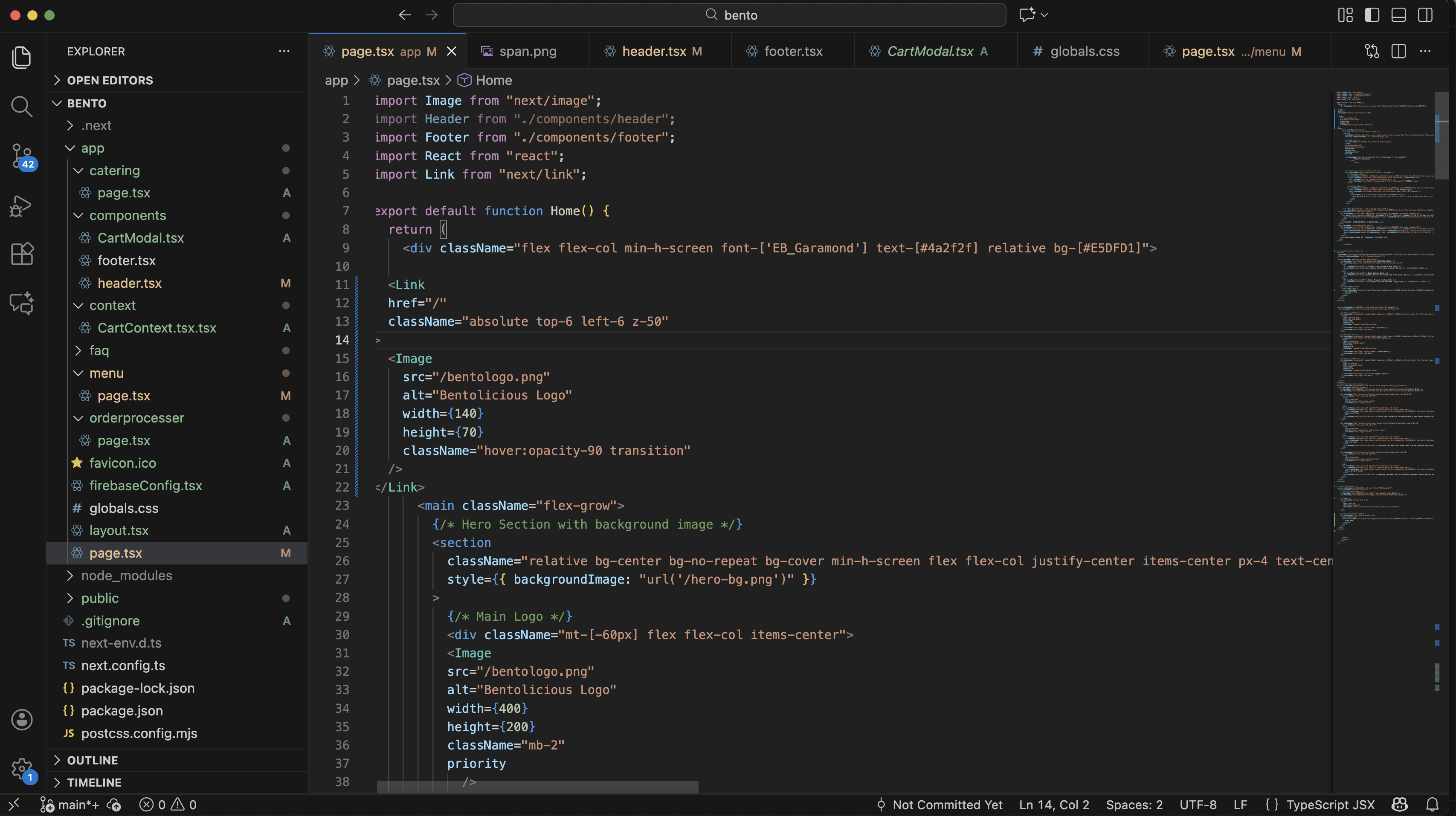
I owned the front-end implementation of the ordering system, ensuring design fidelity, accessibility, and predictable state behavior across the entire flow. The system was built in React with modular components to support scalability and future menu updates.
FINAL SHIPPED PRODUCT
Website redesign and ordering experience shipped version!
While translating the Figma designs into production, I made targeted design adjustments to meet the client’s request for a more professional tone, especially in the ordering flow. I also added clearer feedback and structure to ensure users felt confident at each step of checkout.
TAKEAWAYS
From research to designing to developing, I learned a lot taking full ownership of the end-to-end experience of a product
The project pushed me to think beyond visual polish and focus on usability, constraints, and real-world decision-making across design and development.
🧪
Designing under tight timelines
Because the ordering experience was built quickly, there was limited time for formal usability testing before development. This reinforced the importance of even lightweight validation.
⚖️
Balancing user needs and business goals
Designing a direct ordering flow required balancing clarity and ease-of-use with Bentolicious’s business priorities, like reducing third-party reliance and supporting catering orders. I learned how small UX decisions like CTA placement, cart visibility, and confirmation states can directly influence trust and conversion.
🛠
Thinking like a designer and a developer
Building the cart and ordering flow myself deepened my understanding of technical constraints, state management, and scope tradeoffs. Shipping the experience end-to-end sharpened how I communicate design intent in a way that translates cleanly into implementation.
© 2026 Diya Mahapatra 🪻
Let's Get in Touch!
resume 🗂️ | email 📩 | linkedIn 👥