PRODUCT DESIGN
Carbon Sustain - B2B Carbon Analytics Platform and Dashboard
I led UX research and redesigned key dashboard flows and platform website to increase trust and improve navigation comprehension by 30% and data clarity by 40%.
TIMELINE
Sept - Dec 2024
ROLE
UX Research Lead
& Designer
SKILLS
Figma
TEAM
3 Designers
1 Project Manager
WHAT IS CARBON SUSTAIN
Carbon Sustain is an AI-driven carbon emissions analytics and reporting platform that helps businesses track and act on their carbon emissions
Built for climate-focused enterprises, Carbon Sustain helps sustainability teams understand their full emissions profile and make data-informed decisions toward decarbonization with less manual work and more clarity
THE PROBLEM
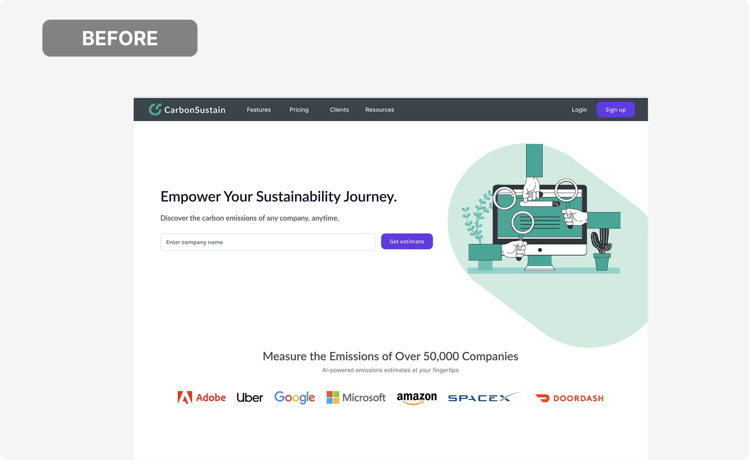
Identifying Friction in the Existing Website Experience
As the main channel for onboarding companies into their decarbonization journey, the website struggled to clearly communicate Carbon Sustain’s offering.
👤 No CTAs
Users were not guided to a clear next step or how to engage with the platform
📄 Unnecessary Visuals
Visuals take up space with no purpose
🔗 Poor branding = no trust
Outdated visuals and inconsistent branding
☁️ How might we get users to understand the goals of Carbon Sustain, trust the company, and navigate the website effectively to use the services it offers?
USER INTERVIEWS
Researching how teams actually manage carbon data
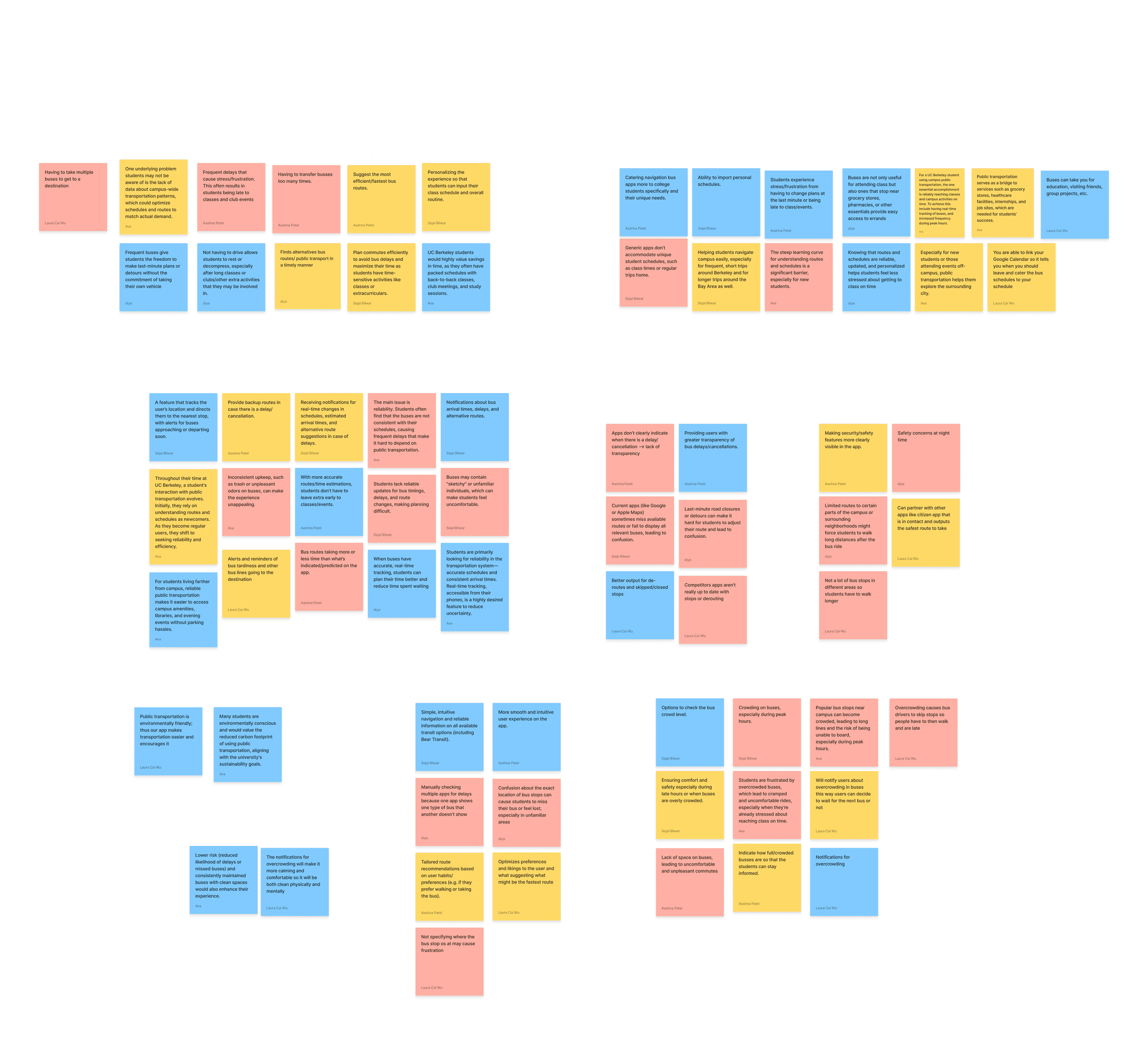
Through interviews with 18 sustainability professionals (companies and analysts), I explored how emissions data is reported, understood, and used to drive decarbonization decisions.
| teams understand what their emissions are, but struggle to interpret what to do next—especially when data is abstract or poorly contextualized.
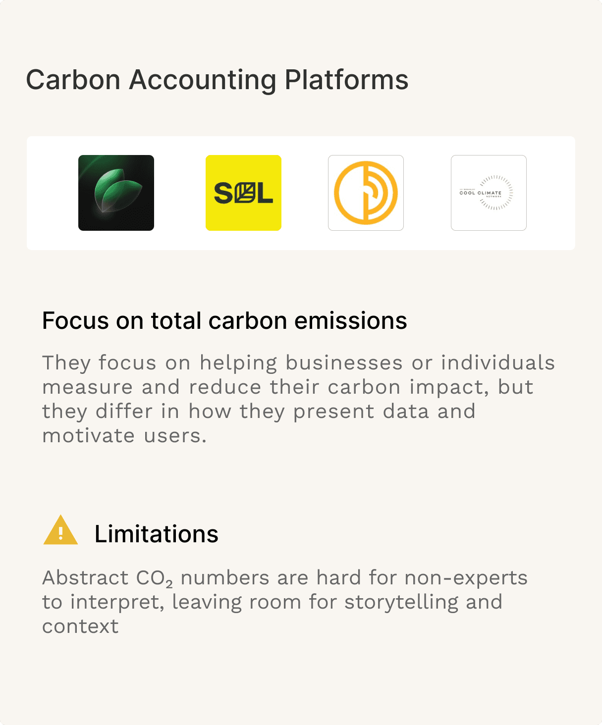
COMPETITOR ANALYSIS
Learning from Existing Carbon Accounting Platforms
Most platforms prioritize raw carbon totals over interpretation, leaving non-experts without guidance or narrative context.
AFFINITY MAPPING
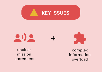
From Research to Key Insights
Affinity mapping revealed two core issues shaping the current experience: unclear value communication and fragmented information architecture. These insights informed the majority of our designs.
SCOPE
Defining the Design Scope
With a clearer understanding of user needs and the client’s mission, I focused on creating a cohesive visual system across both the marketing site and dashboard. The goal was to reduce cognitive load while reinforcing trust through
consistent hierarchy
restrained color usage,
clear prioritization of key actions and metrics.
SOLUTION
Creating a new and improved design system to stay consistent with branding patterns
To align with Carbon Sustain’s brand and sustainability mission, I developed a cohesive design system grounded in muted, earth-tone colors, clean typography, and minimal UI components. This system was applied consistently across both the marketing site and dashboard to create a calm, credible experience while keeping complex data easy to scan and understand.
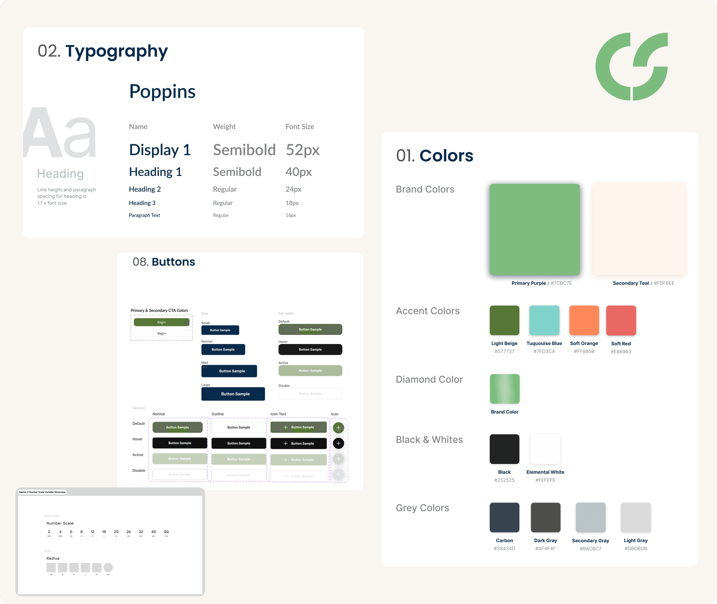
ACCESIBILITY
Design Considerations
Accessibility was considered throughout the redesign to ensure Carbon Sustain’s platform is usable, legible, and inclusive for a wide range of users, including non-experts interpreting complex data.
💢
Color & Contrast
Met WCAG guidelines by keeping key metrics and actions readable across muted, earth-toned backgrounds.
📋
Typography
Clear typographic hierarchy with consistent sizing and spacing improves scannability and reduces cognitive load in data-heavy views.
🫑
Data Comprehension
Charts are paired with labels, icons, and context so insights are understandable without relying on color alone.
SOLUTION
Designing a Unified Experience Across Carbon Sustain’s Core Flows
The solution focused on aligning visual design, navigation, and information hierarchy across the landing page, calculator, dashboard, and authentication flows to reduce friction and build user confidence.
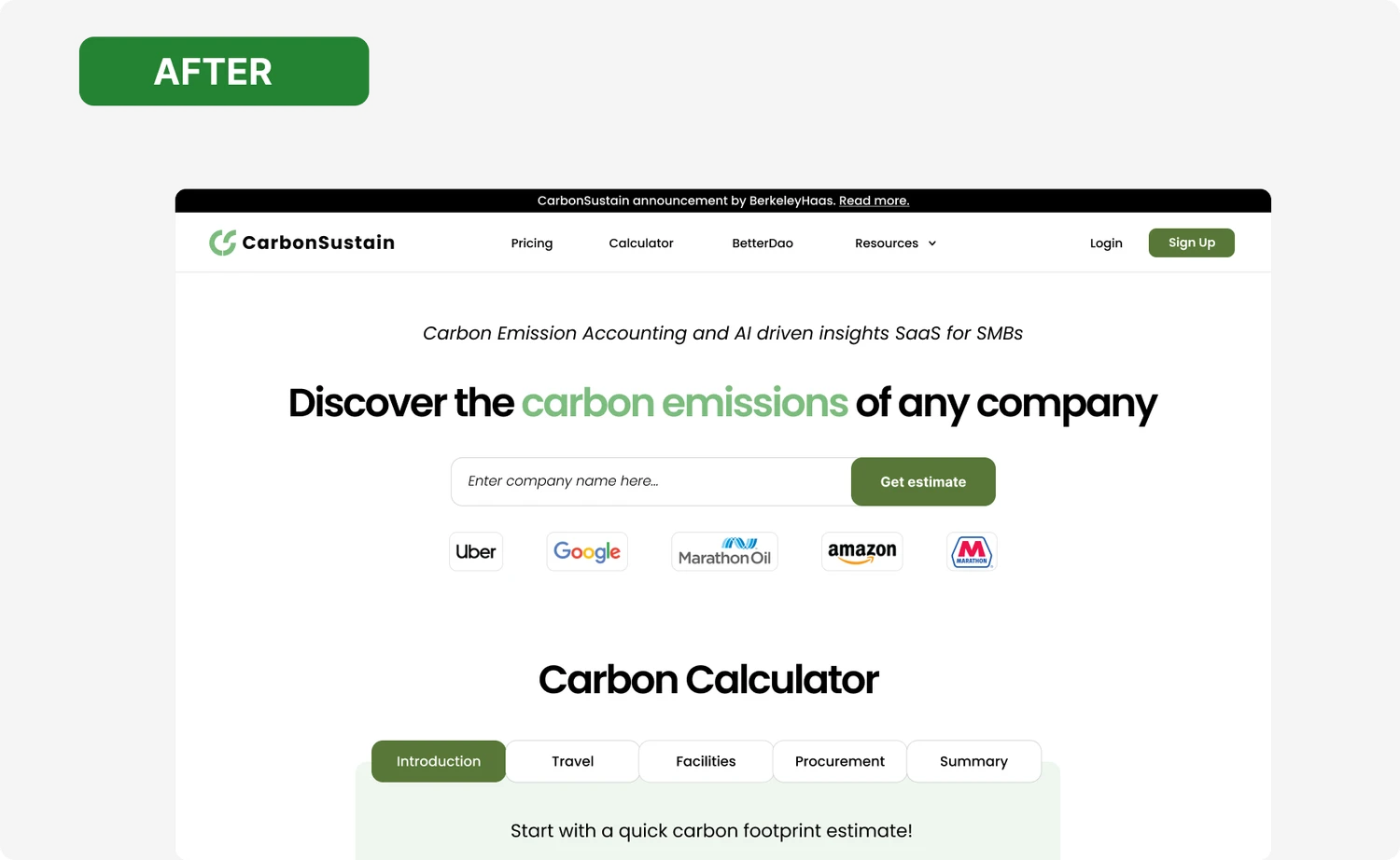
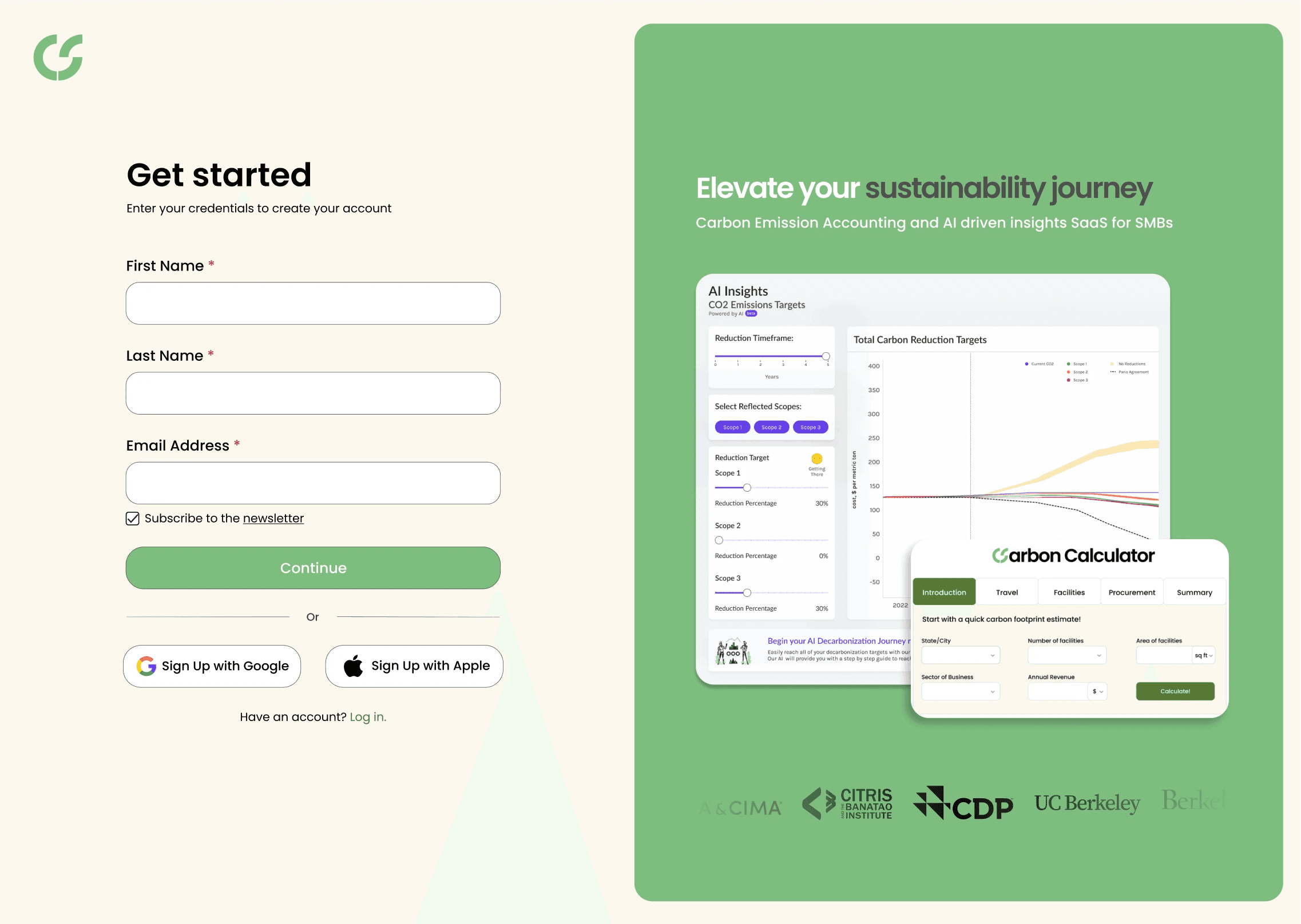
Enhancing Trust and Clarity on the Landing Page
My goal was to design a first-impression experience that immediately communicates Carbon Sustain’s value, builds credibility, and guides users toward action without overwhelming them.
Establishing Clear, Scalable Product Flows
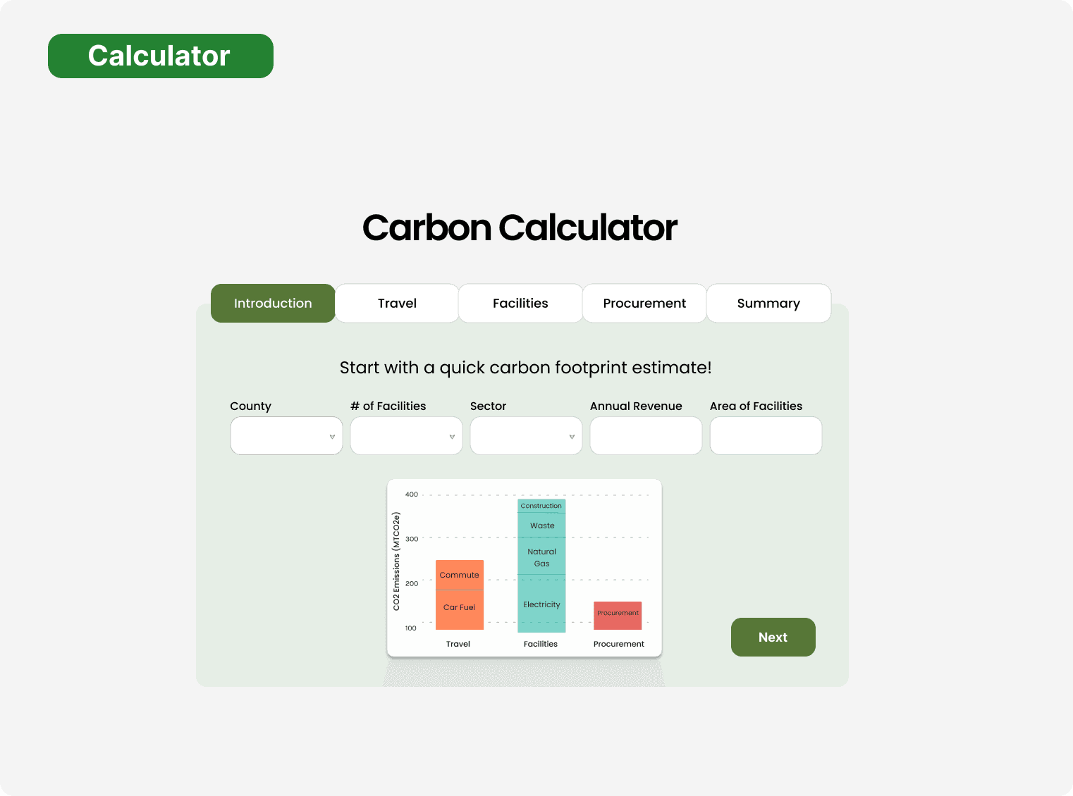
I separated the calculator into clearly labeled tabs so users can focus on one category at a time instead of facing all inputs at once. This progressive flow reduces cognitive load and mirrors how users naturally think about emissions sources.
As users enter values, the carbon impact graph updates dynamically, helping them immediately see how each input contributes to their total footprint. This turns abstract CO₂ numbers into something tangible and easier to interpret.
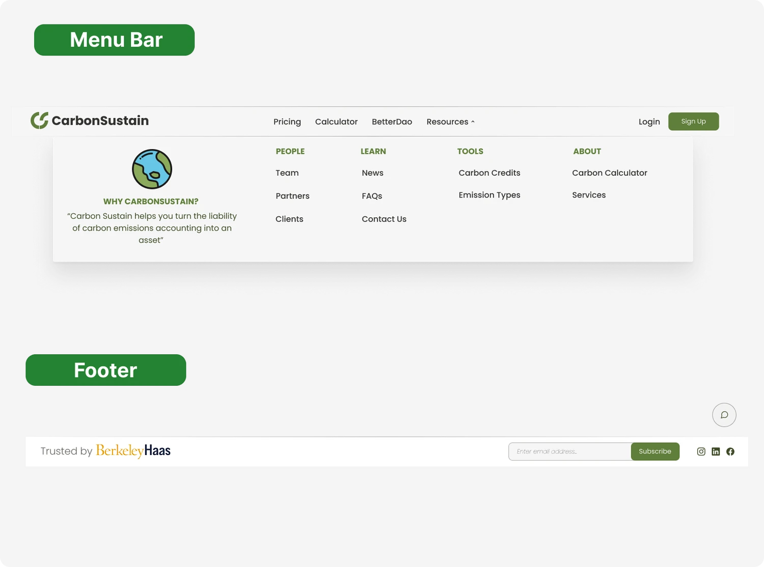
I reorganized the menu bar and footer to improve information hierarchy, helping users quickly locate tools, resources, and account actions without unnecessary scanning.
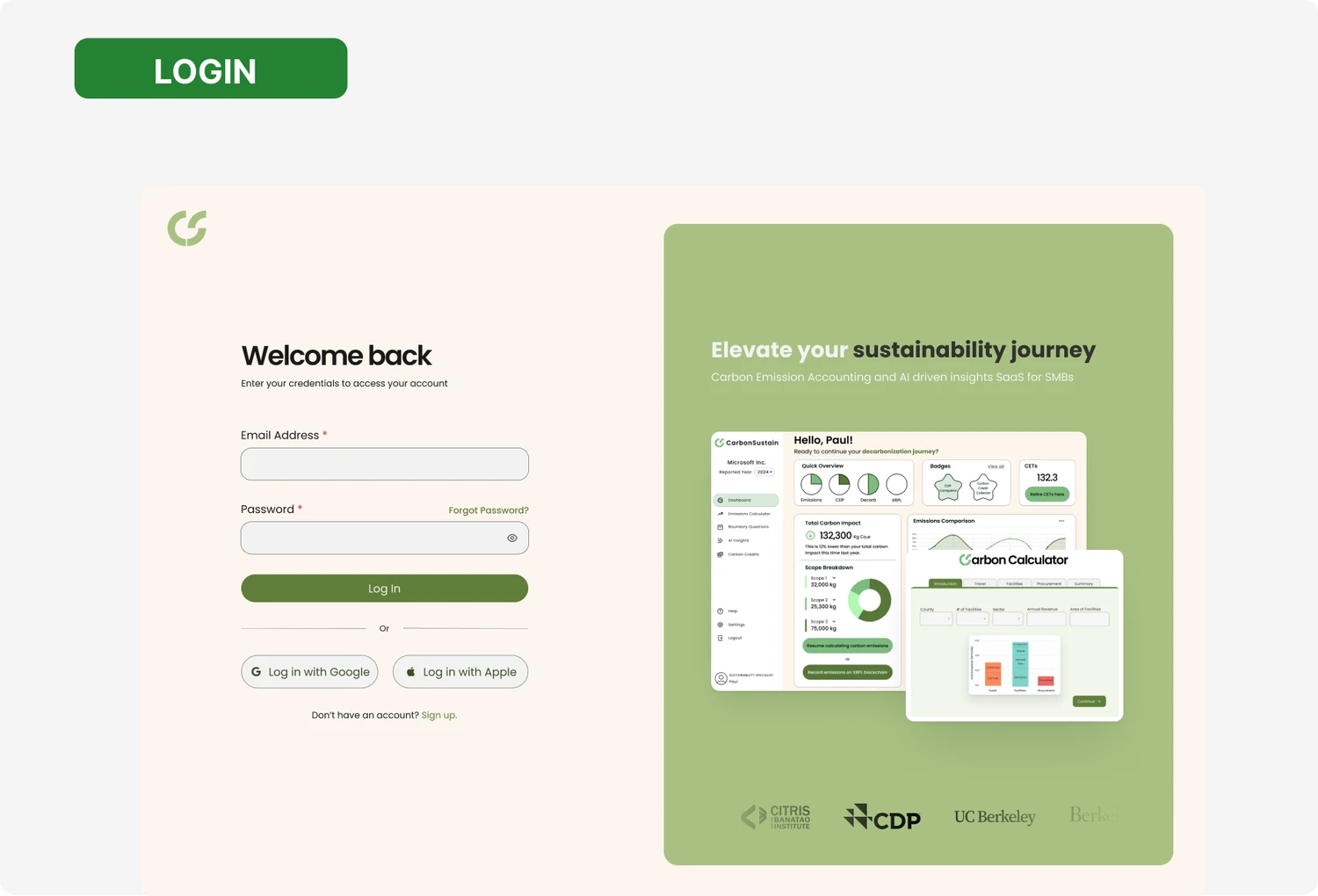
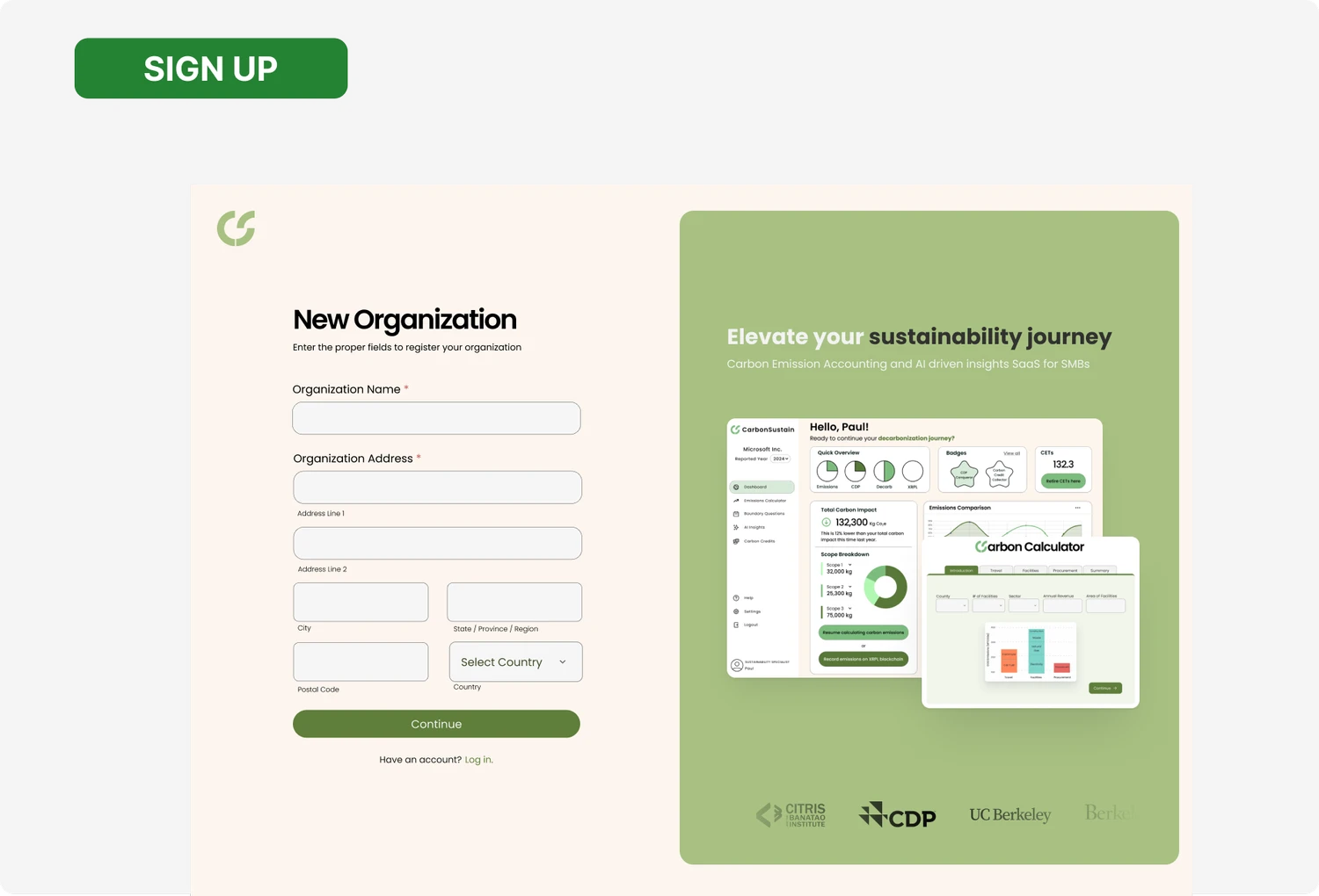
Streamlining access and trust within the login and sign-up flow
To ensure a consistent and credible first-time experience, I designed login and sign-up flows that align with the refreshed design system and reduce friction for new users. The focus was on simplicity, accessibility, and reinforcing trust through clear layout, secure sign-in options, and recognizable partner signals.
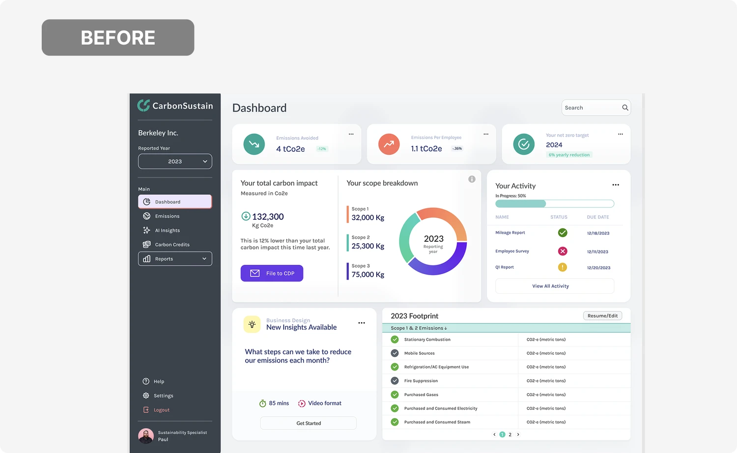
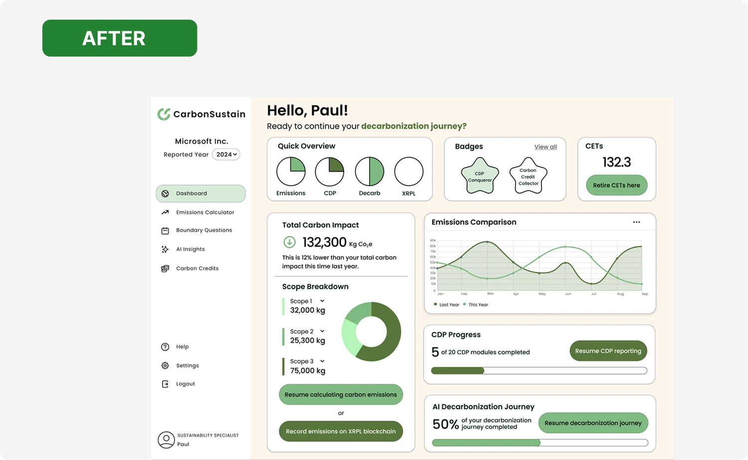
Clarifying complex carbon metrics through visual hierarchy and feedback
The dashboard redesign focused on making carbon data immediately understandable while motivating continued progress. Dense tables and fragmented visuals were replaced with a clear hierarchy, visual summaries, and progress indicators that help users quickly interpret their footprint and identify next steps. Subtle gamification also reinforce momentum.
IMPACT - WHY IT WORKS
Redesigned information architecture that improved navigation comprehension by 30% and increased perceived clarity of carbon metrics by 40%
Navigation Comprehension
Clear information architecture, focused CTAs, and simplified flows help users understand what to do next without guesswork.
Makes Data Understandable
Visual hierarchy, labeled charts, and contextual cues transform abstract emissions data into insights users can interpret and act on.
Builds Credibility and Trust
Consistent branding, accessible design patterns, and professional onboarding establish trust early
especially for non-expert users.
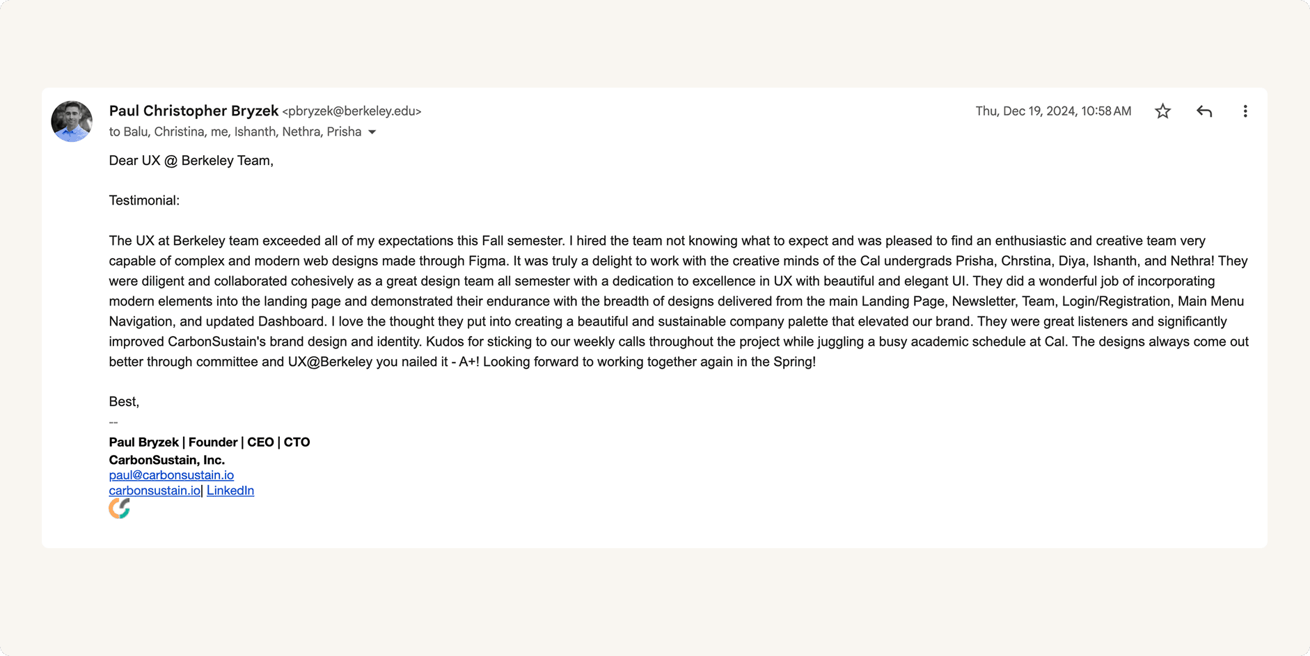
FEEDBACK
Thank you to our client, Paul!
REFLECTION
What I learned and what I'd improve next time!
🚀
Deepening validation through usability testing
Given more time, I would have conducted additional usability testing on the calculator and dashboard to validate comprehension across different levels of sustainability expertise.
🚀
Designing for real users and real constraints
This project marked my first experience designing for a live client, which pushed me to balance user needs, business goals, and technical feasibility. I learned how to move from exploratory concepts to shippable designs while making intentional tradeoffs under real-world constraints!
🤝
Communicating design decisions across disciplines
Working closely with product leads and engineers helped me become more confident articulating design rationale using research insights, metrics, and constraints. I learned how to advocate for clarity and accessibility while staying aligned with product timelines and feasibility.
© 2026 Diya Mahapatra 🪻
Let's Get in Touch!
resume 🗂️ | email 📩 | linkedIn 👥