PRODUCT DESIGN
Flourish AI - Health Insights for GERD Patients
Designed and shipped a meal detail page and end-to-end meal logging flow, and led early exploration of third-party health data integrations for a health AI startup to help users better understand symptom patterns.
TIMELINE
Jun - Sept 2025
ROLE
Product Design Intern
SKILLS
Figma
Cross-Functional Collab
TEAM
2 Designers
1 Product lead
THE PRODUCT
Helping users understand and manage their gut health
Flourish AI is a digital wellness app that uses food logging, AI, and health data integrations to help users understand gut health, identify triggers, and make informed lifestyle decisions.
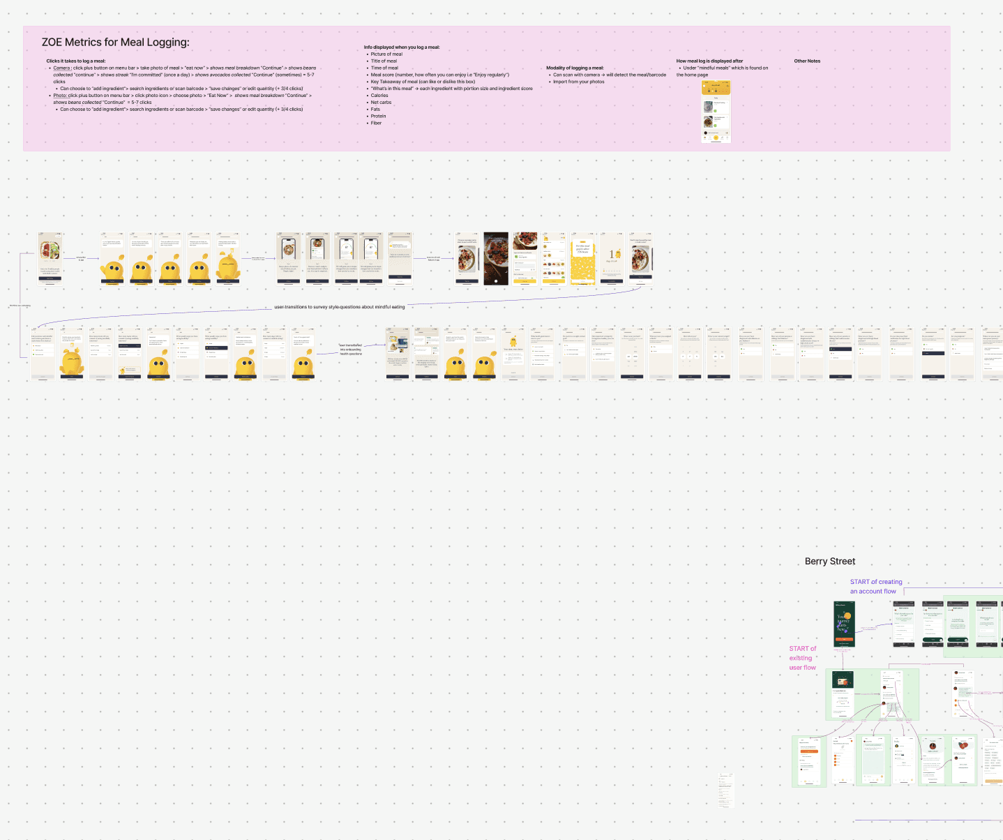
CONTEXT
Logging and viewing meals is key
Every Flourish AI user needs to do two things well: log meals effortlessly and understand how those meals affect their symptoms. This became the foundation for Flourish AI’s core meal tracking experience and my job to lead.
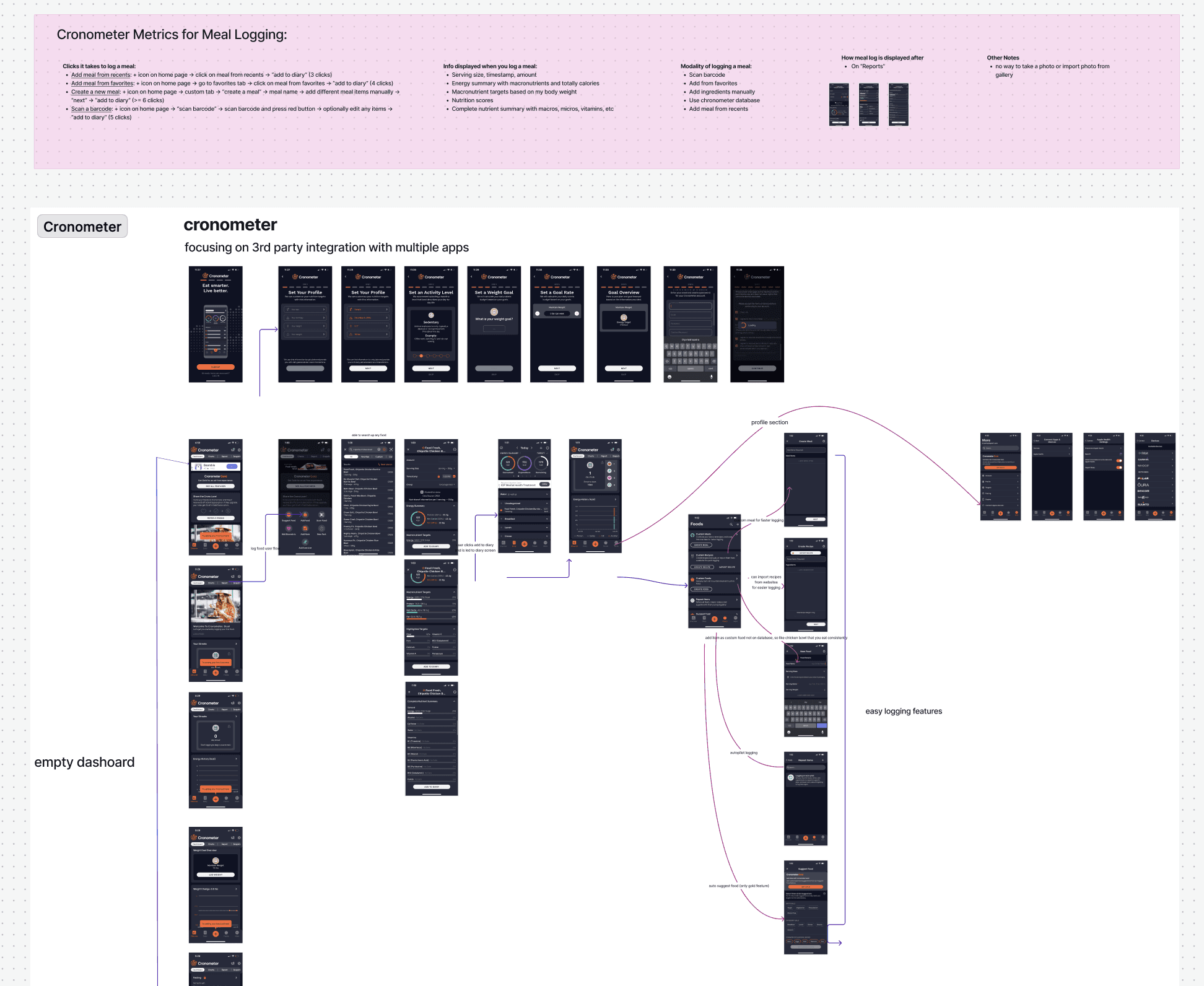
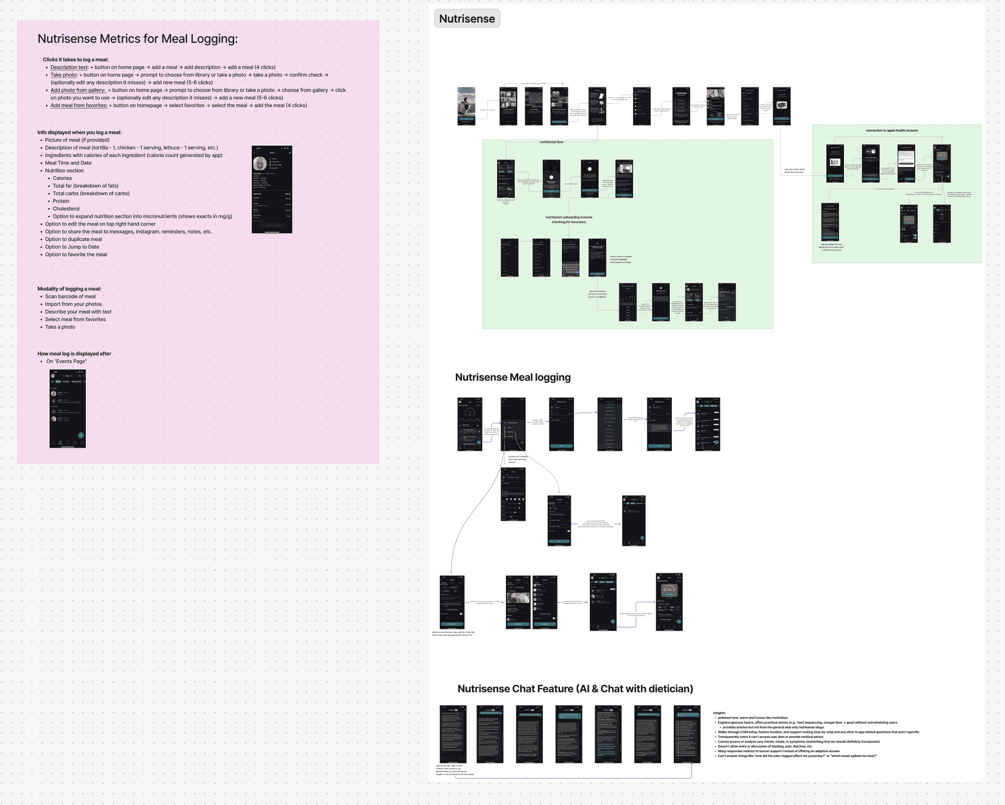
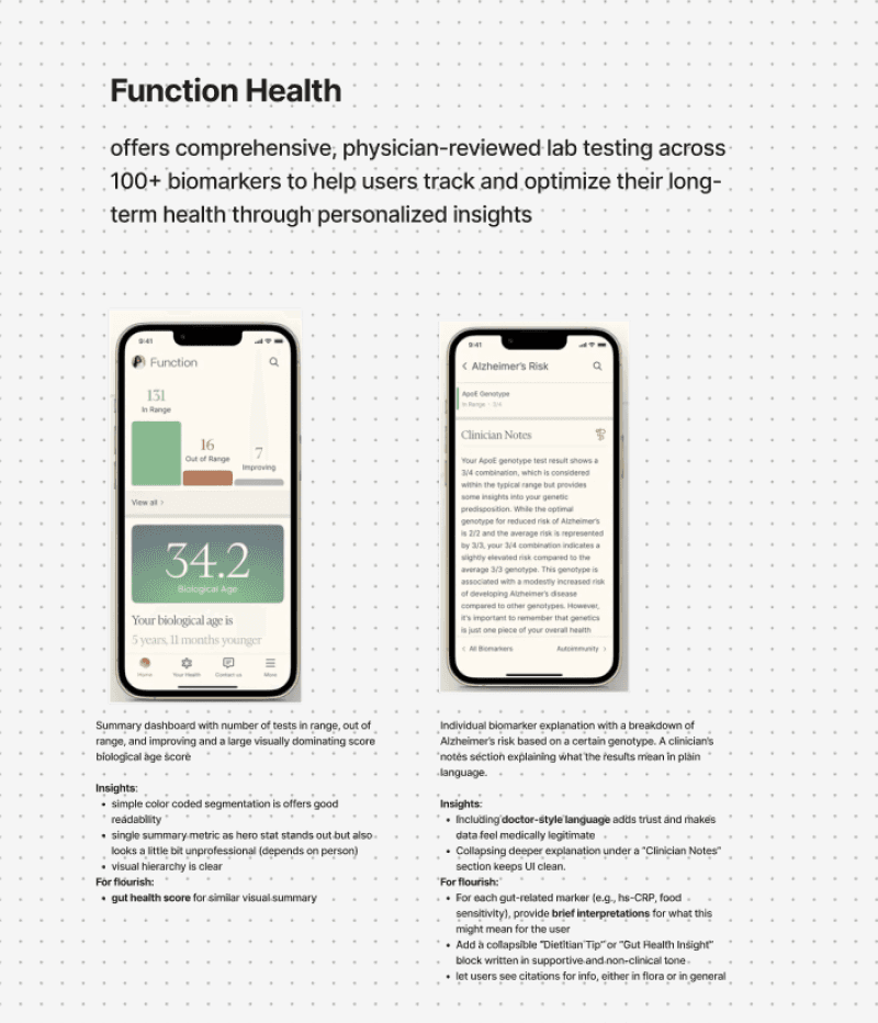
COMPETITOR RESEARCH
I wanted to understand the current gaps in other nutrition help apps
I looked at 5 top platforms that focused on meal logging and nutrition tracking and found key strengths, weaknesses and key metrics used for their meal logging processes.
Strengths
Health trend visualizations
Personalized recommendations
Expert-backed guidance
Data-backed insights
________________
Weaknesses
Overwhelming data density
High friction meal logging
Insights often surfaced after
☁️ How might we simplify the meal detail page for users while maximizing the amount of information they are able to see while reducing cognitive load?
SPEAKING TO USERS
I interviewed 15 users with various gut health related conditions
I asked different users with GERD, IBS, diabetes, and other conditions on how they manage their symptoms
and what their painpoints are in the current apps they
are using.
📄 Drowning in Data
Dense nutrition details make viewing insights overhwleming
👤 Personalization drives motivation
Users want to see trigger details tailored to their own symptoms
🔗 No cause -> effect
Users want clear signals that link what they ate to how they feel
OPPORTUNITIES
I guided my team to 3 main ideas for the MVP
Based on my overarching user interviews and competitive market research, I mapped different features that we could add to our product to maximize personalization and insights gained while minimizing effort and drop off.
💢
Irritant Score
Feature that focuses on a trigger score for each meal for ease of view.
📋
Different Mods
User can use various ways to log a meal to avoid dropoff and simplify use.
🫑
Macro Count Carousel
Carousel for a visual of different types of macro counts that have been met.
*All 3 of these features were shipped!
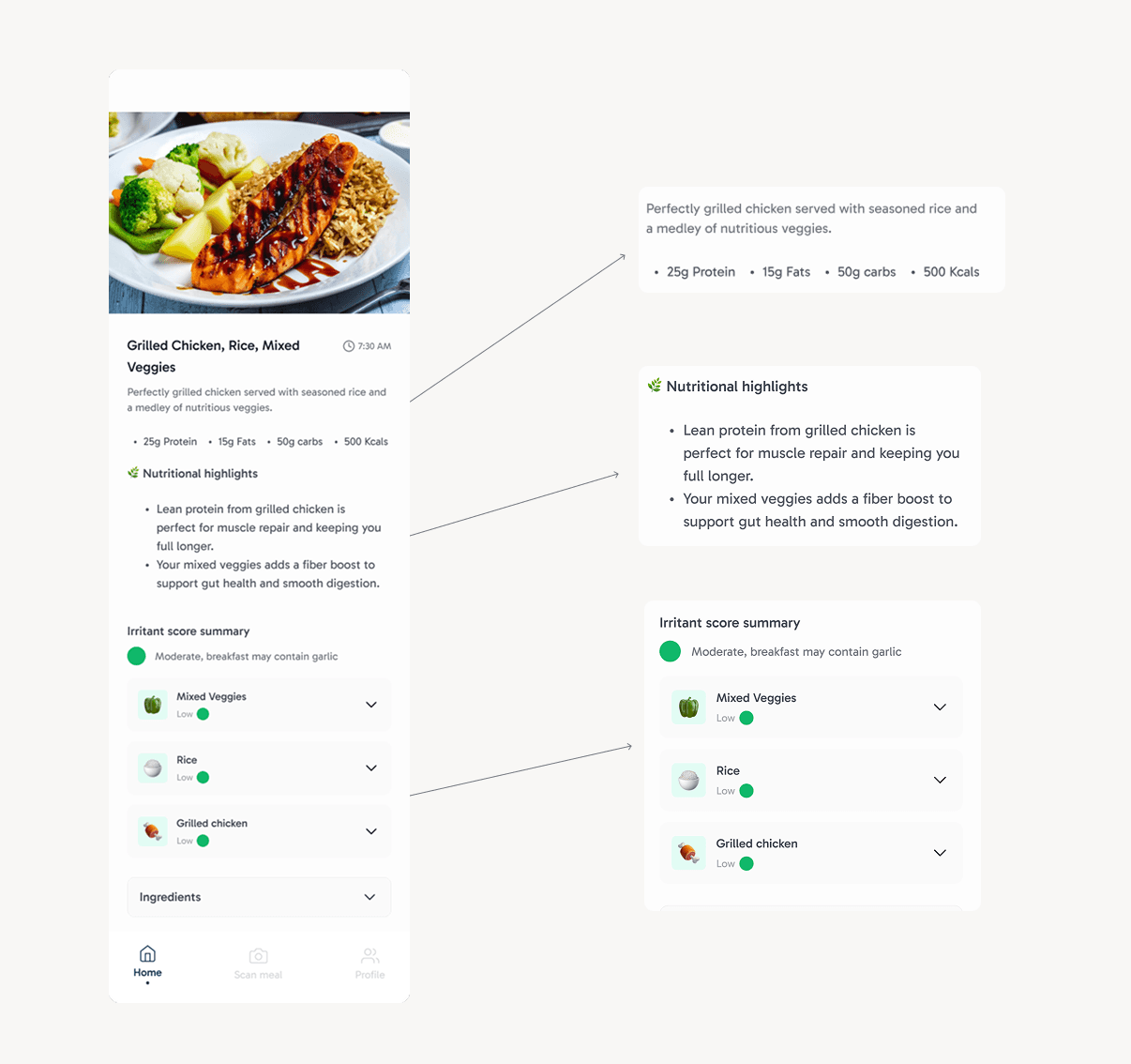
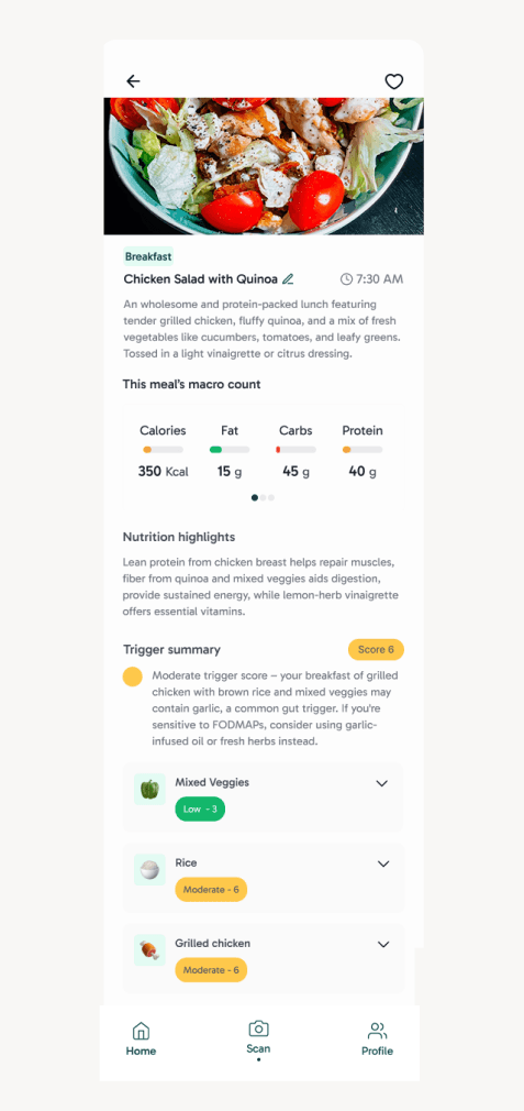
EARLY MEAL DETAIL PAGE CONCEPT
The meal detail page
The initial meal detail page, while it did show a summary of the logged meal and an overall irritant score summary, it lacked actionable insight for the user to know how the scores were calculated and the next steps they should be taking. This early concept did not have the most trust from our user.
DEFINING MEAL DETAIL PAGE FEATURES
I ideated 3 key feature enhancements for the meal detail page from feedback and research
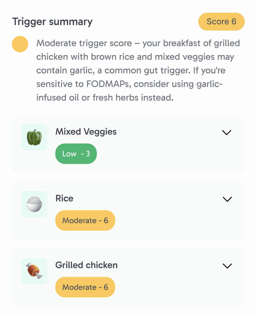
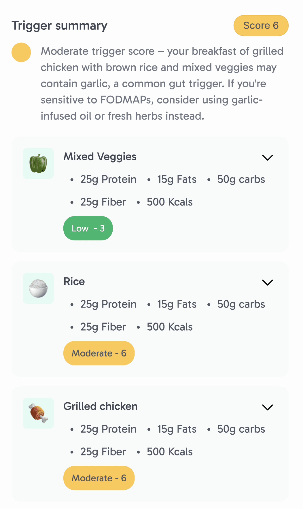
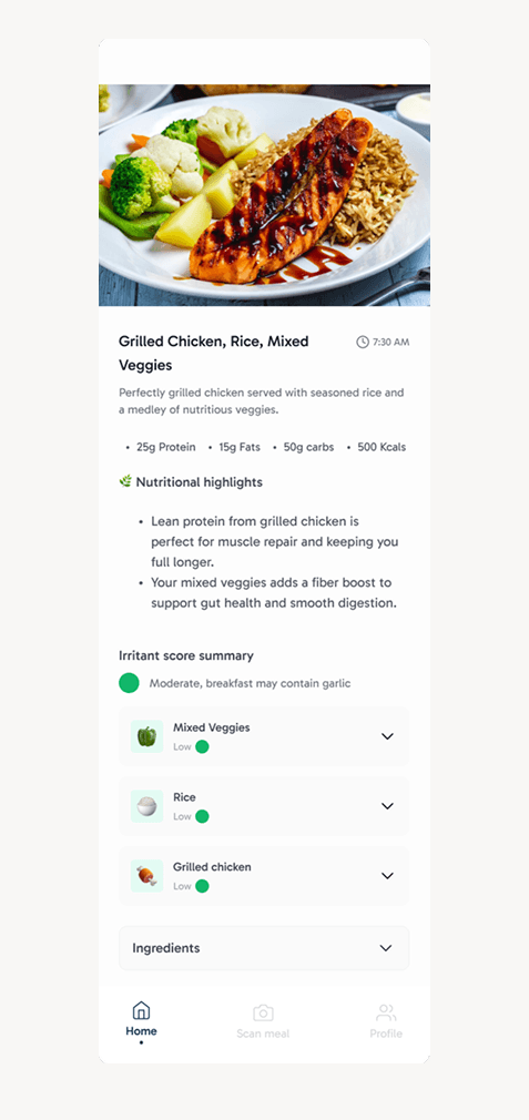
Feature 1: Trigger Score
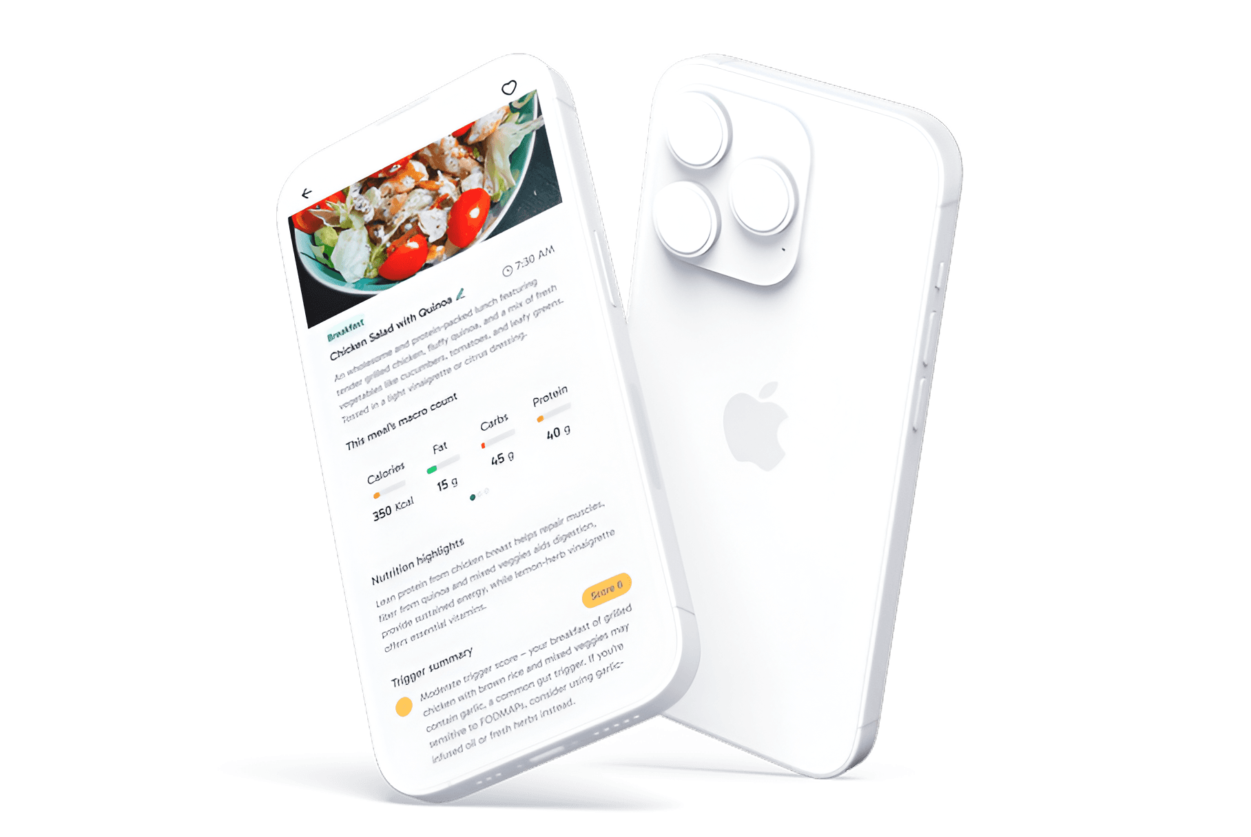
Translates complex nutrition and symptom data into a personalized and ingredient-level risk score for each meal. Powered by our in app AI (Flora), it explains why a meal or ingredient may be triggering and suggests specific ingredient swaps tailored to each user’s sensitivities.
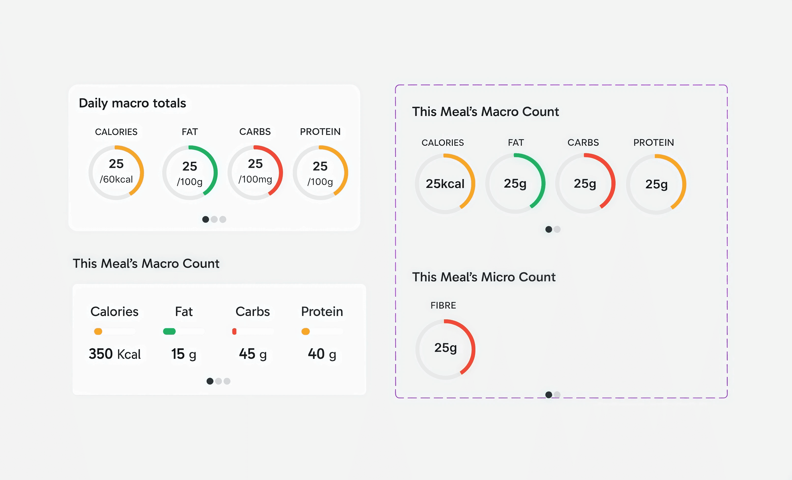
Feature 2: Macro Visualization
Replaces dense words with intuitive visual summaries that let users quickly understand how a meal contributes to their daily goals. By showing per-meal and daily macros side-by-side, users can contextualize individual meals without doing mental math
Feature 3: Edit Logged Meal
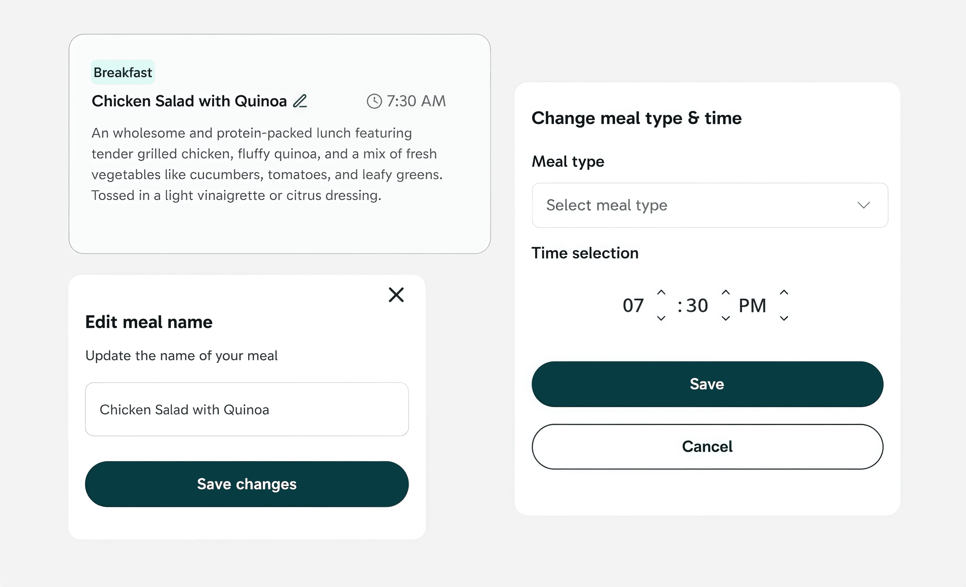
Lets users easily update meals after logging, accommodating mistakes, late entries, or changes. This flexibility helps maintain trust in the data powering downstream insights.
USABILITY TESTING
According to users, the macro counts are misleading in terms of units
After this round of usability testing, I changed the circular bars to horizontal bars to depict units in a better form. This way, it would be easy for users to keep track of the scale of their meals.
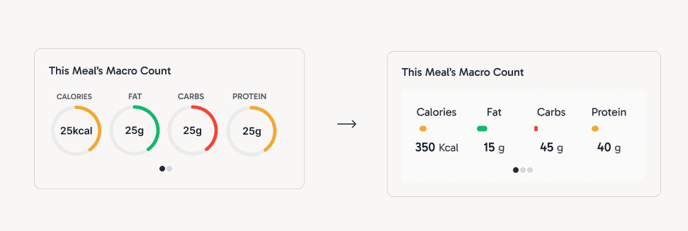
ITERATION 1 VS ITERATION 5
From start to finish, I wanted to make this page as personalizable and visual, while also informative, as it can be
Initial Iteration
Initial screen with little visualizations and explanations
Final Design
Screen I owned and shipped with trigger scores, explanations, and macro visualizations
MVP2
But wait, there's more
After shipping the core meal detail experience, I began exploring MVP 2 opportunities focused on integrating third-party health data (e.g., Apple Health) to surface broader trends. Before my internship concluded, my co-design intern and I had time to brainstorm features for our main goal for MVP2, 3rd party app integration.
USER PERSONAS
Who is our target user?
After exploring three personas, I focused on users who want to understand why symptoms occur and how to prevent them, not just track data. These users seek clarity and personalized guidance that connects meals, lifestyle factors, and symptoms into actionable patterns.
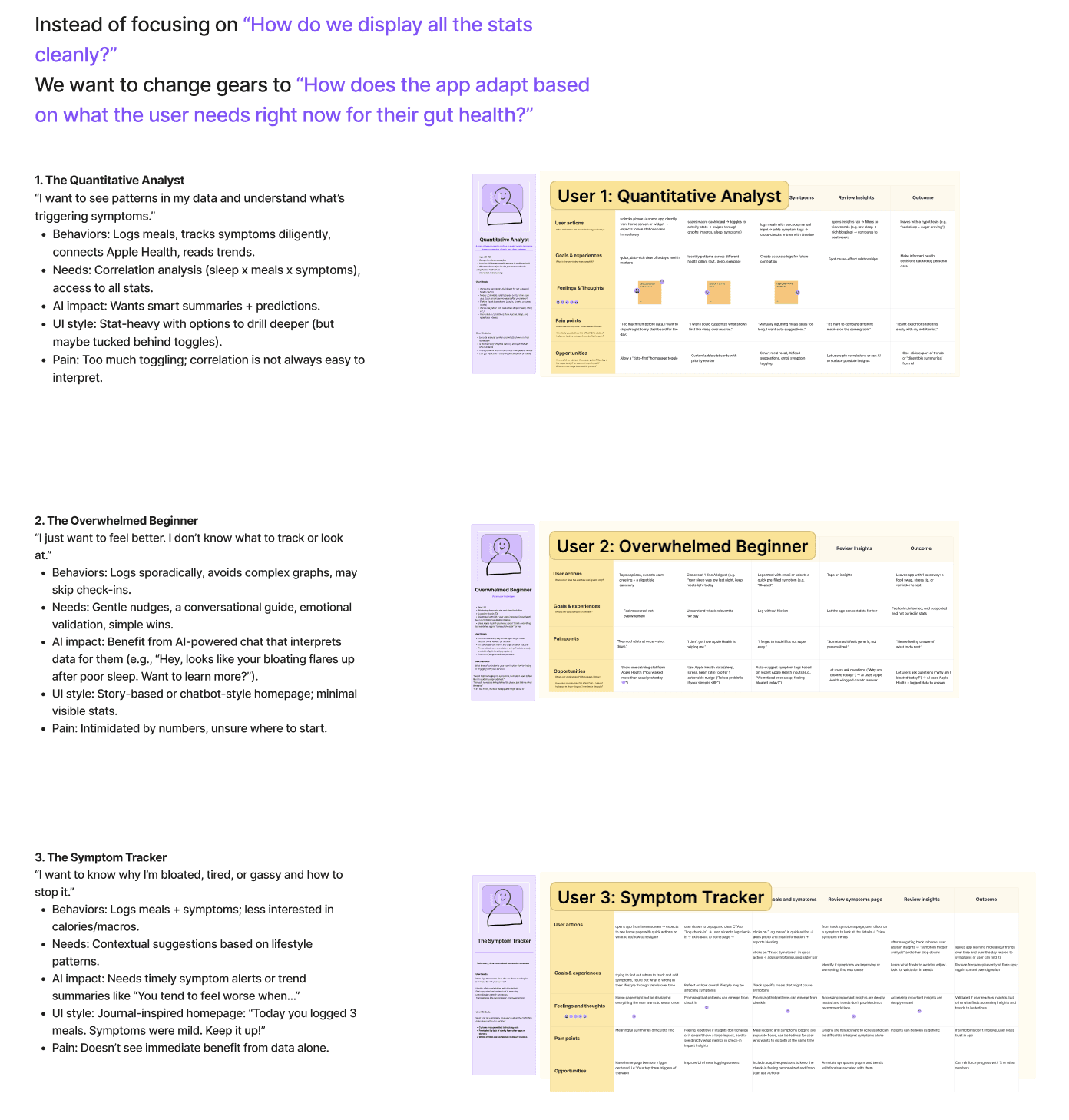
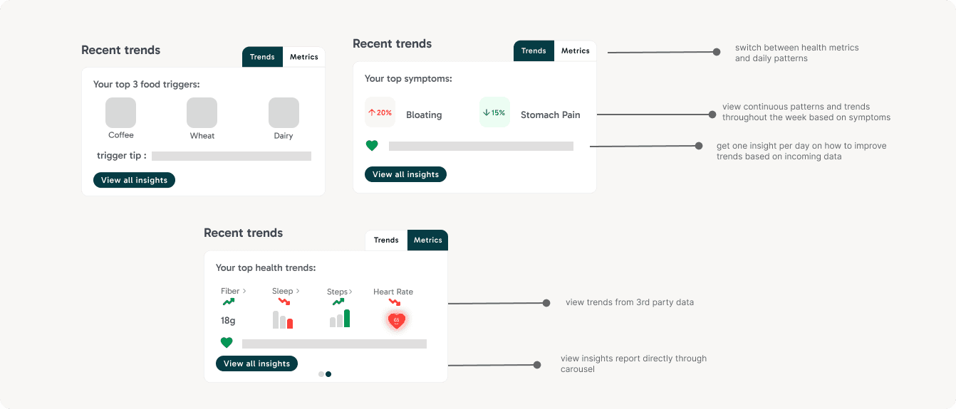
FEATURES THAT INSPIRED MVP2
Based on early research and persona work, I explored lightweight homepage components that help users quickly connect external data to their gut health patterns.
Although these are not fully flushed out due to time constraints, these components surface high-level trends like lifestyle metrics from 3rd party apps to help users recognize patterns at a glance and gives them a personalized tip every day based on their habits, updated daily. I made sure that these components are not data dense to adhere to all kinds of users.
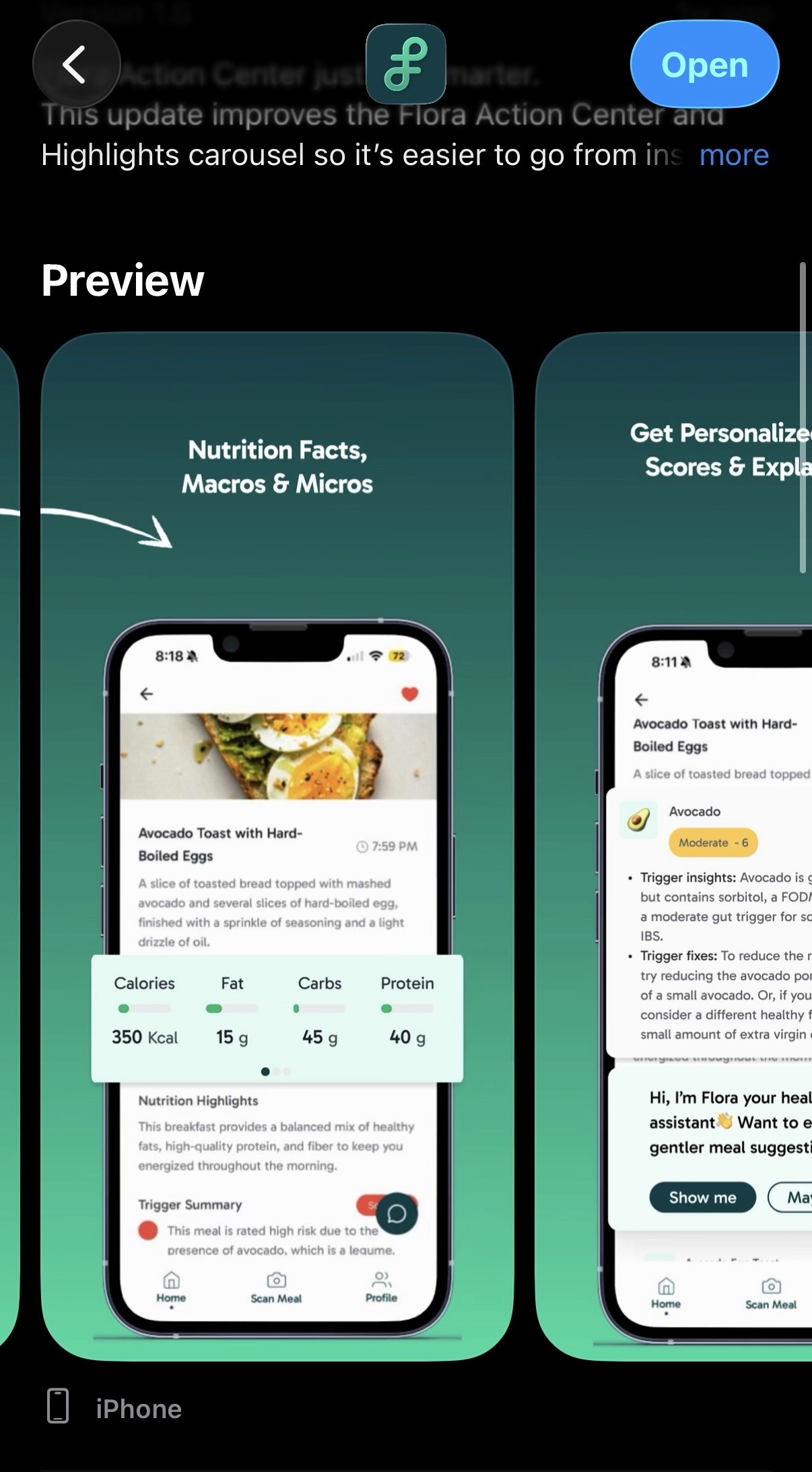
FINAL DESIGN
Turning Complex Gut Data into Clear, Actionable Insights
A redesigned meal detail experience that helps users understand triggers faster, reduce cognitive load, and take informed actionable insights into their daily dietary needs.
FEATURES THAT INSPIRED MVP2
My screen is featured on the app store!
With a second round of usability testing through our beta users, we found a 47% reduction in time spent interpreting meal insights and a 68% increase in users correctly identifying personal food triggers.
REFLECTION
This internship improved my design and communication skills!
✏️
Designing at scale within an existing system
Working within a large, established design system pushed me to think more intentionally about components, auto-layout, and variants, and to make thoughtful tradeoffs between consistency and clarity
🔄
Adapting quickly in a fast-moving startup environment
As soon as MVP1 shipped, priorities shifted toward new problem spaces, requiring me to context-switch between execution and early-stage exploration. This taught me how to balance shipping polished work while contributing to ambiguous, forward-looking initiatives without losing momentum
💬
Communicating design decisions across disciplines
Collaborating closely with PMs and engineers strengthened my ability to articulate design rationale using research insights, constraints, and tradeoffs. I became more confident advocating for users while staying aligned with product goals and technical feasibility.
© 2026 Diya Mahapatra 🪻
Let's Get in Touch!
resume 🗂️ | email 📩 | linkedIn 👥